Or: Everyone Wants the Tokyo Cat
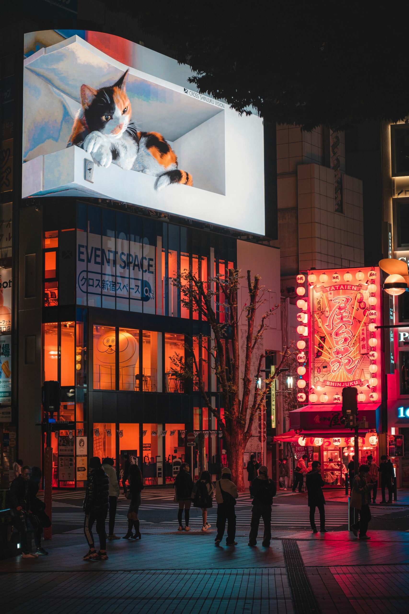
Everyone wants anamorphic content on a corner LED (LED wall – we’ll be using industry slang a lot in these pieces) and sends as a reference a YouTube clip of an anamorphic cat animation from above the east exit of Shinjuku station in Tokyo.
And they want exactly that at their event or trade show booth.
OK, I get the fascination. When I first saw an anamorphic animation on an LED wall, I was genuinely blown away. It’s an outstanding eye-catcher – still fairly unique, and with enormous viral potential.
Unfortunately, there are buts. More than one.
What Is the Sweet Spot in Anamorphic Animation?
It’s worth starting with the fact that anamorphic animations took their name and concept from painting. Originally, anamorphosis is a technique from painting and optics (known since the 16th century) – it involves deliberately distorting an image so that it only looks normal when viewed from a specific angle or through a special mirror or lens. That specific angle is what we now call the sweet spot – the position from which the animation looks the way it’s supposed to.
„The way it’s supposed to” doesn’t mean better than from everywhere else. It means that from every other position, the animation will simply look wrong — distorted and visually unappealing. How large the sweet spot is, and how bad the animation looks outside it, can be controlled by choosing the right screen shape and the right type of animated content.
Test on a Physical Screen, and Don’t Leave It to the Last Minute
The next big but is testing on a physical screen. Without physical tests, it’s very easy to make mistakes that will ruin the effect on the target wall. This applies especially to the event industry. If you’re counting on being able to fix something 24–48 hours before the event, you may be in for a rude awakening.
Anamorphosis is sensitive to very specific physical parameters: screen proportions, the exact geometry of the corner, the resolution and pixel pitch of the specific model. An animation that looks perfect on screen may not work at all on different hardware than the target — objects stop „popping out,” depth disappears, the illusion falls apart. At events, there’s an additional factor: screens are often assembled from multiple segments on-site, and minimal angular deviations during assembly can completely destroy the effect. That’s why we always test animations on hardware identical to the target — and weeks, not days, before the event.
It’s not overkill. It’s the basic condition for making the cat jump out of the screen rather than get smeared across it.
LED Wall Surroundings and the Sweet Spot – Design the Space, Not Just the Animation
Another aspect is the screen’s surroundings. They can make it so the animation can only be viewed from the sweet spot. I once saw a trade show booth whose walls were designed in such a way that the LED screen was only visible from the correct perspective. The Shinjuku cat, due to the dense urban layout around the station, was also mainly visible from the sweet spot.
In practice, it always comes down to the same goal: we want viewers to land almost exclusively in the sweet spot — and that’s not nearly as straightforward as it sounds. Sometimes you can design an animation with a wide enough sweet spot to naturally cover the entire zone where viewers will be standing. Other times, the surroundings themselves need to be actively adjusted to suit the animation — directing foot traffic, configuring the booth layout, placing barriers. It sounds overly formal, but in practice it’s just another part of the project — no different from choosing the screen’s resolution.
Color and Brightness Around the Screen – How Not to Break the Illusion
A separate topic is the relationship between the screen and its immediate surroundings. Elements adjacent to the LED wall — walls, structures, booth backgrounds — the closer they are in color to the animation, the better. The goal is for the animation to look naturally built into its environment, not like a screen bolted to a wall with something sticking out of it.
That’s the difference between an installation that stops people in their tracks and one that earns a polite „oh, nice” before they walk on. Brightness matters just as much: an overly lit screen and its immediate surroundings make it easier for the eye to detect that it’s just a surface. The brain immediately gives up on the illusion — and no cat is jumping out of that screen for anyone. The optimal conditions are those where the boundary between the animation and its environment is as invisible as possible.
A Few Things Nobody Tells You Before Production
To sum up: I’ve picked out a few aspects that in practice tend to be most often ignored or underestimated — and that can determine whether an installation makes an impression or just takes up space. I’m writing about this with a degree of tongue-in-cheek, because my main goal is to give people who’ve never worked with anamorphic production a bit of a foothold on the subject.
You won’t find detailed answers here – not because I’m withholding them, but because laying them out properly would require not a column, but a proper doctoral thesis.
So if you’re considering producing an anamorphic animation, instead of trawling through more YouTube clips, just book a short call with me. We’ll figure out what can be done, what might go wrong, and whether your cat has a chance of jumping out of the screen in one piece.